Apr 26, 2016
Functional Vs. Superfluous UI Animations
When something becomes easy, people go crazy with it. Desktop publishing made it possible for anyone to print a flyer, and it was seconds before someone decided it would be fun to include as many fonts and clip art as possible.

As it becomes easier to design animated prototypes using tools like Flinto for Mac, there’s always a concern that people will overdo it. When it’s easy to make every element on a screen fly in and bounce all over the place, why not do it? It’s so much fun!
Your customers will hate you.
There’s a time and place in your UI for loud animations. Just as the best print layouts make use of a small amount of carefully chosen fonts, the best UI animations tend to be the subtle ones that people barely notice. They advance the utility of the UI. Animations can and should help with the function of your app.
I have an example prototype that I build whenever I demo Flinto for Mac for local startups. My favorite transition in this prototype is a photo zoom effect where the user taps a photo thumbnail and it zooms to full size.
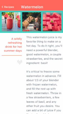
This is a great animation because it looks nice, it’s fun to invoke, and it serves a functional purpose. This animation helps the user maintain a mental model of where they are in the app. They can see the photo they tapped move seamlessly to full-size, giving them a solid sense of how they are flowing through the app, where they came from, and how to get back.
Animations like this are extremely easy to do in Flinto for Mac thanks to the connected layer feature. By connecting the small photo to the big photo, the animation happens automatically. There is a video about this on our tutorials page.